The Bottle as a Work of Art: The History of Our Vessels
Before it was ever a bottle, perfume at L.T. Piver was first a gesture. In 1774, a shop named "À la Reine des Fleurs" opened in Paris, selling a lavender-scented cleaning solution then used to refresh leather gloves, a common practice among glove-perfumers of the time. Above the door hung a richly illustrated sign, depicting "A la Reine des Fleurs" carried on a cloud and surrounded by three cherubs, a symbol the house still carries today. At this stage, the vessel itself mattered less than the gesture and the sign: it was the sign that first gave the house a face. In 1799, Michel Adam's son took over the business, before dying without an heir in 1805. His cousin Pierre-Guillaume Dissey then took over the succession alongside Louis-Toussaint Piver, the two men running the house together for nearly twenty years, until Piver found himself alone at the helm in 1823, upon Dissey's death, and gave the house the name it still carries today: L.T. Piver.
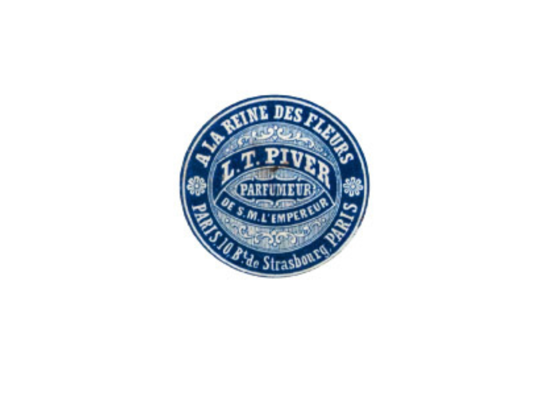
In the decades that followed, the care given to presentation extended beyond the bottle alone: it spread across the entire commercial gesture. Under Louis-Toussaint Piver, every product came with detailed explanatory notes, affirming the authenticity and quality of its manufacture, a direct response to the growing threat of counterfeiting. The house went so far as to affix a genuine guarantee seal onto its most copy-prone bottles: a blue medallion stamped “Cachet de Garantie” (Guarantee Seal), paired with a numbered green band announcing the fight against counterfeiting. The labels themselves became small graphic works in their own right: that of the Vinaigre des Quatre Voleurs bottle, octagonal in shape, is illustrated with a costumed scene evoking its legendary origin.
This same attention to graphic detail extended even to the most modest products in the catalogue. A range of scented soaps, sold under evocative names such as la Fée du Plaisir, le Savon Chinois, la Sultane Favorite, or le Savon du Dey d’Alger, was presented in packaging adorned with portraits in traditional costume, painted with a care worthy of a genuine collection of illustrations, far removed from simple wrapping paper.
Jacques Rouché, or the Ambition to Turn the Bottle into Art
Toward the end of the 1890s, Jacques Rouché, a graduate of the École Polytechnique with a passion for theater and politics, married Berthe, the eldest daughter of Lucien Piver, and took the reins of the house. His ambition went far beyond scent composition: he wanted to change the very image of French perfumery, working with as much rigor on the graphic design of labels and boxes as on the formulas themselves. He surrounded himself with talented collaborators and reorganized the house’s production sites, all while devoting himself in parallel to the arts: his collaboration with the Théâtre des Arts, and later his appointment as director of the Paris Opera, where he would later be nicknamed the savior of the institution, reflect that same aesthetic rigor applied to very different worlds.
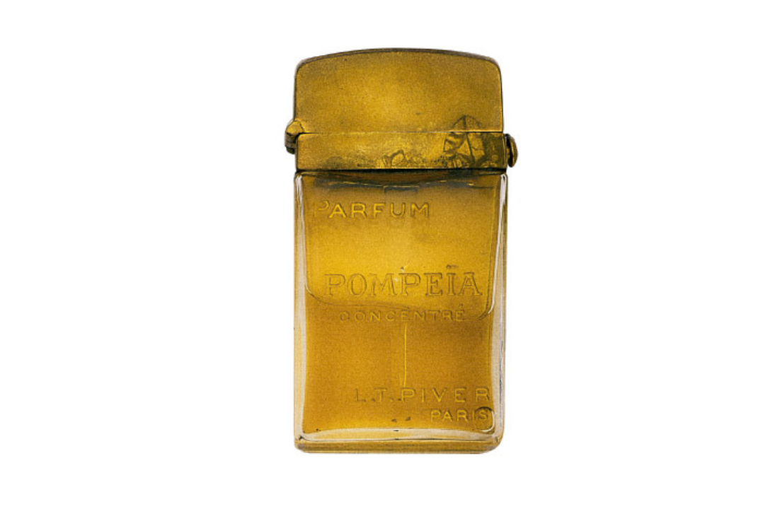
This ambition reached its full expression in 1907 with Pompeia, born of that same collaboration between Jacques Rouché and the chemist Georges Darzens. Inspired by the archaeological excavations then unearthing the ashes of Pompeii, the two men composed a fragrance evoking ancient splendor, presented in a squat, faceted Baccarat bottle, its name engraved directly into the glass, sober and dense like a cut gemstone.
Between Reformulation and Art Deco
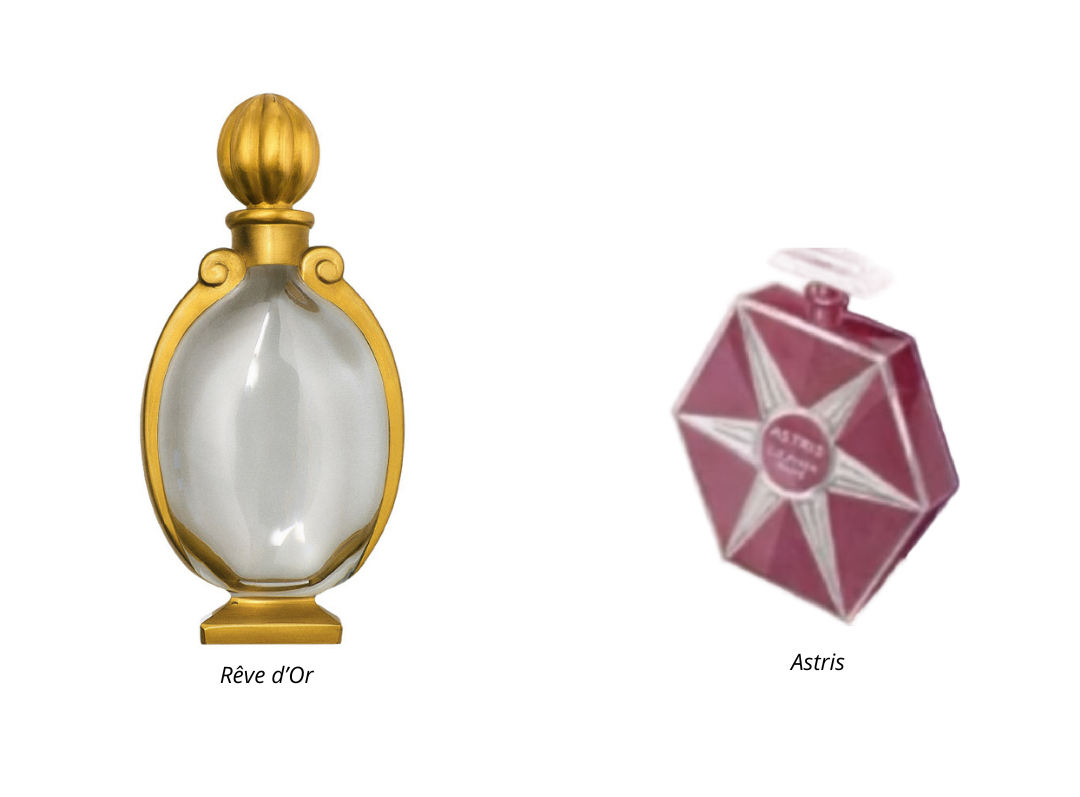
The fragrance Rêve d’Or, meanwhile, has a story told in two acts. First launched in 1889 under the name Rêve d’Or n°1, it was reworked in 1925 by Pierre Armigeant, who had succeeded Georges Darzens at the head of the house’s laboratory. It was on the occasion of this reformulation that the bottle, too, was entirely redesigned, entrusted to Louis Süe and André Mare, two pioneering figures of the emerging Art Deco movement, and executed by Georges Chevalier, then director of Baccarat’s creative studios. The result, an urn-shaped body on a pedestal foot adorned with gold-lacquered scrollwork, perfectly embodies the spirit of the era: bold geometric lines, understated luxury, and a constant dialogue between glass and gold that echoes the very name of the fragrance.
Other collaborations with Baccarat would follow in the decades to come: this was the case with the Astris bottle, a hexagonal crystal flask, sometimes tinted pink, adorned at its center with a silvered six-pointed star, still regularly offered today at auction by several specialized houses in both France and the United States. But this supremacy of cut crystal, however refined, would not last forever: a few decades on, an entirely different graphic language would come to shake up the codes established by Rouché.
Ilka and Diableries: The Fragrance Takes the Stage
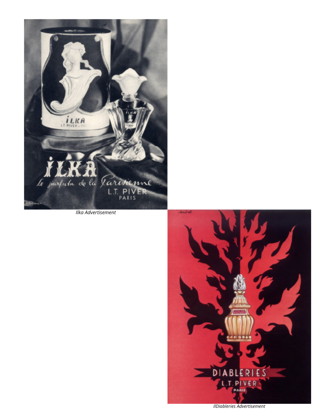
Under the direction of Thierry Godilliot, great-grandson of Lucien Piver, the house experienced a new creative surge in the immediate postwar years, carried by a series of landmark launches: Baccara in 1946, Ilka in 1948, then Diableries in 1950. These creations, bold and innovative in composition, reflect the house’s avant-garde spirit at a moment when an entire industry had to reinvent itself, allowing it to stay relevant in a rapidly shifting perfume market.
Ilka, released two years after Baccara, is one of the most striking examples. Its period advertisement, a black-and-white photograph, features two vessels side by side: a squat jar with a domed lid and a slimmer bottle, both bearing the name Ilka. The slogan accompanying the campaign, “le parfum de la Parisienne” (the fragrance of the Parisian woman), sums up the product’s ambition in a single phrase: it no longer sells just a bottle, but an entire look, a way of inhabiting the city, at a time when Paris was gradually reclaiming its status as the capital of elegance after the war years. It marks a shift in register from previous decades, where the bottle itself, in ornately cut crystal, carried the entire weight of the gesture: with Ilka, it is the advertising photograph and the slogan that take over to build the product’s image, foreshadowing the codes of perfume advertising as we know them today.
Two years later, in 1950, Diableries adopted an entirely different graphic language, that of the pure poster. The name itself, with its touch of mischief and knowing transgression, finds a direct echo in its presentation: a striking contrast of red and black, with stylized flames framing the bottle like a true illustrator’s composition, signed André. Nothing here owes anything to Art Deco restraint or the sobriety of engraved crystal: color itself becomes the message, an invitation to temptation as much as a fragrance. From one launch to the next, this decade thus saw the house move from Ilka’s elegant photography to Diableries’ boldest graphic poster, never returning to the sole logic of cut crystal that had prevailed until then. Two opposite approaches, born only a few years apart, both turning the bottle into a visual medium in its own right rather than a mere vessel.
A Dialogue That Continues Today
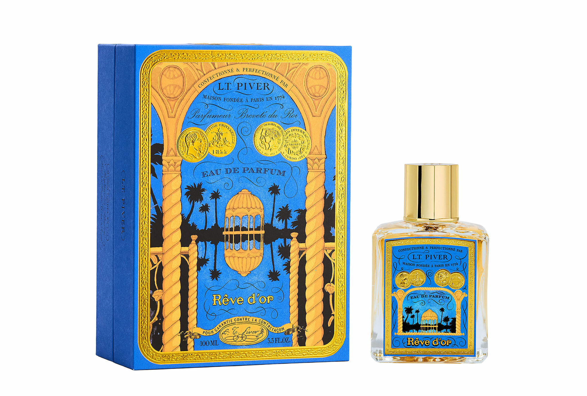
Since the house was taken over by Nelly Chenelat in 2021, that same attention to detail animates the new Premium Niche collection. Today’s bottles, with faceted lines that deliberately recall these precious editions of the past, come with cases adorned in gilding and hand-illustrated by a watercolor artist. The medallion that now adorns some of our boxes directly echoes the iconography of the original sign: À la Reine des Fleurs on her cloud, surrounded by the same cherubs, framed by a ribbon that reads “L.T. Piver has been perfuming the world since 1774.” Two hundred and fifty years after Michel Adam’s sign, the same gesture endures: the idea that a fragrance is never simply meant to be smelled, it is also meant to be looked at and collected.
Perhaps it is no coincidence that so many of our vintage bottles, from Pompeia to Astris, Rêve d’Or, Diableries, or Ilka, are sought after by collectors today and displayed alongside the greatest names in French perfumery. At L.T. Piver, the vessel has never been just a vessel.
Discover our bottles today, where heritage meets modernity.
Personalized Gift
Gift wrapping available with every order.
Customer Service
Our team is here to assist you: contact us by email.
Free Delivery
With any purchase $over 150
Complimentary Sample
Complimentary fragrance sample with purchases of 65€ or more.